A simple time series model of pandemic excess deaths to help answer the 1M dollar question: Part 2
A wrench may turn out to be the key

In my last post, I built a simple time series model to explain US excess deaths during the 2020-2022 pandemic years. The final model presented in the post included 8 regressors (modeling 8 separate COVID waves) and 1 regressor for weekly vaccine doses administered. All the terms in the last model made sense, except for the negative beta weight assigned to the 4th COVID wave w4, which occurred between March and June of 2021. The period encompassing the COVID wave w4 has been shaded grey shown in the below graph of the z-scored variables in the model.

In trying to understand what in going on there, I honed in one the grey section of the graph above. In order to inspect this period, I created a new plot whose x-axis range was restricted to just the shaded region, and I then z-scored the variables to force them all onto the same scale for visualization purposes.
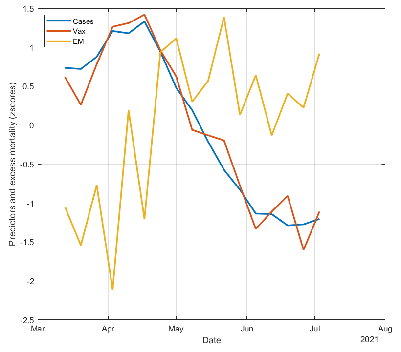
What jumps out of this plot is that vaccine doses and COVID cases are almost perfectly correlated. It appears that this COVID wave w4 was caused by the vaccines, which hit their peak around April 16, 2021. This is consistent with all the recent literature showing that the vaccines increase infection risk, especially in the first two weeks following vaccination.
The graph also shows that excess deaths begin to rise with both vaccine doses and COVID cases from March through mid-April, but from late April onwards, excess deaths remain elevated while COVID cases (and vaccine doses) decrease. This effectively “decouples” COVID cases from excess deaths, resulting in the negative correlation and beta weight for w4 that was observed in our model. In other words, the usual positive, strong correlation between COVID cases and excess deaths was disrupted by the US vaccination drive hitting its peak during this period.
This rise in excess deaths from March through mid-April, and its persistent elevation through July 2021, appears to be the first clear sign of excess deaths attributed to the vaccines, which were previously masked (at least in these graphs) by the large COVID wave w3 that preceded the 2021 mass vaccination campaign. The persistent, elevated excess deaths is unlikely to be caused by delayed effects of COVID cases, due to the relatively consistent 8-day lag between COVID cases and deaths and the strong correlation between COVID cases and excess deaths in the 3 COVID waves (“w1”, “w2”, and “w3”) prior to the vaccination campaign (data not shown).
To test this idea a bit more, I did a quick calculation to see if the rise in excess deaths divided by the rise in vaccine doses during this period gives an estimate for VFR that is in line with previous estimates (see concluding paragraphs of my last post). For this, I first smoothed the data using a 5-pt moving average. I then took the difference between the maximum excess deaths and excess deaths at the first week (March 13, 2021), and divided that by the difference between the maximum vaccine weekly doses and weekly doses at March 13, 2021. The calculation yielded 0.069%, which is similar to the estimated VFR of ~0.03% when using the beta weight across the entire time series from the last post.
Does the effect “replicate”?
Next I wanted to see if a jump in excess deaths shortly following a peak in administered doses could also be observed for subsequent booster “waves”. The below plot zooms in on the period from September 25, 2021 through March 26, 2022. The first booster was approved for high risk individuals and ages 65 and older on September 21, 2021, and eligibility was expanded to ages 18 and older on November 19, 2021.
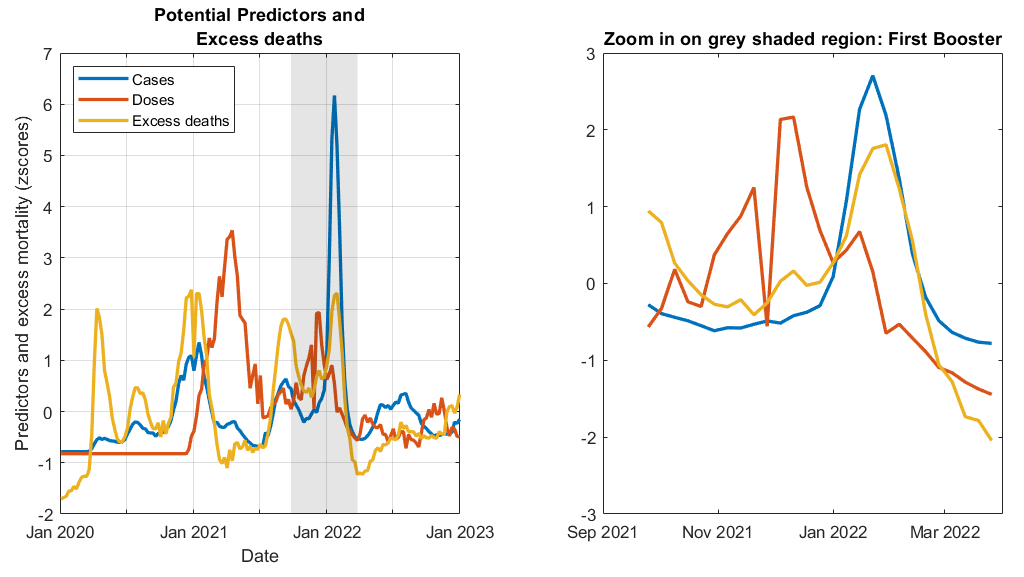
In the graph above, the downward spike in doses (red line) shortly after November 2021 reflects the (temporary) reduction doses over Thanksgiving weekend. There is a small bump in excess deaths (yellow line) that occurs right after the red line spikes back up following Thanksgiving weekend that is uncorrelated with COVID cases. This bump may reflect excess deaths caused by the first booster.
Next I plotted the “bivalent booster” wave from September 14, 2021 through December 31, 2022. The bivalent booster was approved for high risk individuals and ages 65 and older on September 1, 2022, and eligibility was expanded to ages 18 and older on September 21, 2022.

In the above graph, the steep rise in excess deaths (yellow line) beginning in November 2021 occurs well before the next COVID wave (blue line) the begins in December, suggesting these were caused by the bivalent doses.
Conclusion
The negative w4 beta weight appears to make more sense now. Closer examination and plotting of the vaccine and booster “waves” reveals visual evidence that excess deaths rise shortly following an increase in doses. I have more confidence in the model presented in my last post. In the next post of this series, I will update the statistics reported in Part 1 in order to account for the fact that the time series data does not meet the assumptions of ordinary least squares regression.
Any critical comments or feedback? Please let me know in the comments section below.
Wait, there’s more!
If you enjoyed this post, please consider dropping me a tip! Your donation will help support my efforts to publish this work.
I was unlawfully terminated from my faculty and research scientist positions because of my research on COVID vaccine risks and other protected activity such as objecting to the university’s COVID vaccine and booster mandates. If you would like to learn more or help me in my legal pursuit of justice and accountability please see this link.
The bumps in cases around April 2021 and January 2022 occurred around the same time in all age groups even though younger age groups got vaccinated later than older age groups: https://i.ibb.co/7tVGHY0Q/cdc-cases-per-age-group.png.
The bump in cases around April 2021 is also missing from many states, even though the rollout of the primary course doses peaked around March or April in all states: https://i.ibb.co/DftmT42L/us-states-cases-deaths-vaccines.png.
You can see all-cause mortality by vaccination status from the Medicare datasets that were given to Kirsch by his source at HHS, and you can see COVID deaths by vaccination status from the CDC dataset titled "Rates of COVID-19 Cases or Deaths by Age Group and Updated (Bivalent) Booster Status". However based on both sources, vacinated people had a much smaller increase in deaths than unvaccinated people during the first Omicron wave in January 2022: https://sars2.net/i/rootclaim-delta-3.png, https://sars2.net/i/rootclaim-cfr-2.png.
Age-stratified data exposes a major weakness of the Rancourtian approach of correlating spikes in deaths with spikes in vaccine rollout. In Peru there was a big wave of deaths around April 2021, so Rancourt blamed it on the rollout of the primary course doses. But the deaths occurred around the same time in all age groups even though younger age groups were vaccinated much later than older age groups: https://sars2.net/rootclaim.html#Rancourts_paper_about_excess_mortality_in_125_countries_3u. And similarly in the Czech Republic there was a spike in all-cause deaths around December 2021 which appears to coincide with the rollout of the first booster dose if you look at all ages aggregated together. But the deaths peaked around the same time in all age groups even though the number of booster doses administered peaked about a month before deaths in ages 80+ but about a month after deaths in ages 40-59 (see my previous link).
I agree that age-stratified analyses is the way to go and a next step, but combining the 3 variables for the same age strata and over the same time period is difficult, if not impossible with existing data (that I could find at least). Also, there are arguments for not restricting the vaccine administrations by age, for example, possible shedding effects as well as vaccine-induced fatal accidents (i.e. a driver suffers a vaccine-induced stroke or heart attack while operating the vehicle and kills other people of different ages) could be deaths in other age groups attributed to vaccinations in older ages. I like the graph in your second paragraph. State to state differences such as urbanicity/population density might help explain why the bump is missing in some states. In regard to the graph in your third paragraph, it wasn't clear to me what the y-axis represents in the grey vs. non-shaded region, and whether the plots adjusts/corrects for percent vaccinated across time? Isn't the blue line higher (and red/green lower) in the beginning because less people were vaccinated at that time? I haven't (yet) read Rancourt's work in detail, but based on the graphs it looks like he doesn't adjust/account for COVID waves in his calculations. Is this correct?