A simple time series model of pandemic excess deaths to help answer the 1M dollar question: Part 1
Anyone with basic stats skills and internet can follow along

Abstract
More research is needed to better understand the effects of the 2021-2022 mass COVID vaccination campaign on net mortality outcomes. In this 3-part series, time series regression will be used to test the effects of COVID vaccinations on weekly excess deaths occurring in the US during the pandemic years (2020-2022), while adjusting for the effect of COVID case rates. In Part 1, plots of the three variables will be presented and a general linear model of daily COVID case rates and weekly vaccine doses administered (independent variables) will be used to predict weekly excess deaths. In Part 2, peculiarities of the model will be examined using magnified visual plots of the three variables. In Part 3, age-specific and lagged effects of the vaccine term will be presented, and the statistics of the model will be updated to acknowledge presence of heteroscedasticity and correlated error terms. Results show that vaccinations had a positive (adverse) effect on pandemic excess deaths, persisting 6-10 weeks post-injection and in all age groups. According to the fitted coefficients, over 200,000 excess deaths in the US in 2021-2022 were associated with same week vaccinations, suggesting that VAERS deaths are underreported by a factor of at least 10. These data are critical for risk-benefit analyses that inform and improve future public health interventions and vaccination strategies.
Introduction
As part of his 2M public debate, Steve Kirsch asked me to use publicly available CDC data to estimate US excess deaths attributed to the vaccine across all of 2021 of 2022. Rather than use a series of monthly ecological regressions that I have applied in the past, for this analysis, I sought a simpler time-series model with higher temporal resolution and fewer comparisons that would allow us to model and adjust for multiple contributors (including COVID) to US weekly excess deaths.
The outcome variable
I grabbed CDC data which lists weekly US excess deaths for every week in 2020-2022. Excess deaths are defined as the difference between weekly deaths and the deaths occurring in those same weeks averaged across years 2015-2019.

Our task here will be to derive and test a model that best explains weekly excess deaths across all 3 pandemic years 2020, 2021 and 2022. The weekly excess deaths from the above spreadsheet will thus be our outcome variable in the model. I first plotted the outcome variable to get a sense of the temporal dynamics and to make sure I extracted the data from the spreadsheet correctly.

The x-axis has 157 time points for each week represented in 2020-2022. First, let’s confirm these numbers make sense. I added the excess deaths in each year and arrived at 567,110 excess deaths in 2020, 688,966 excess deaths in 2021, and 487,694 excess deaths in 2022. In total, 1,743,770 excess deaths across all 3 years. No red flags there.
Our first predictor (regressor)
Next step: model these deaths. The obvious first predictor of excess deaths is COVID. To model COVID waves, I grabbed daily US COVID cases per 1M population from Our World in Data.

I extracted the data, set it in the same temporal resolution (weekly) and range (2020-2022) as the outcome variable and then plotted both variables. Note that I z-scored the variables before plotting to force them onto the same scale and y-axis for visualization purposes.

It already looks like a good fit. But how good? Let’s run a linear regression and see how much variance in weekly excess deaths (blue curve above) we can explain with our COVID wave in red. (Edit: The OWID dataset indicates that “there is a delay between testing, confirming, and reporting a case to international organizations. This means the numbers do not necessarily reflect the number of cases on the specific date.” To account for uncertainty in the lag between COVID cases and excess deaths, I therefore I fit multiple versions of the below model, in which each version included a different lag in days from -8 to 8, and then selected the lag that yielded the best model fit. This resulted in a lag of 4 days).
The above equation models Y, a 157x1 vector with weekly excess deaths in each row, as beta times X, a 157x1 vector with daily COVID cases per 1M population in each row, plus some noise. Small “t” stands for time and small “w” stands for COVID wave. The beta weight will be estimated by our software using ordinary least squares. You can think of the beta weight as a ‘scaling factor’ (i.e. how much should I multiply my COVID wave by in order to achieve the best fit to the weekly excess deaths)? You’ll notice that X is subscripted with t-4, which is to account for a known lag between COVID cases and COVID deaths. Here, I’m using the function fitlm in Matlab v. R2019b, but Excel can run these linear regressions as well. The results from the linear model are shown below:
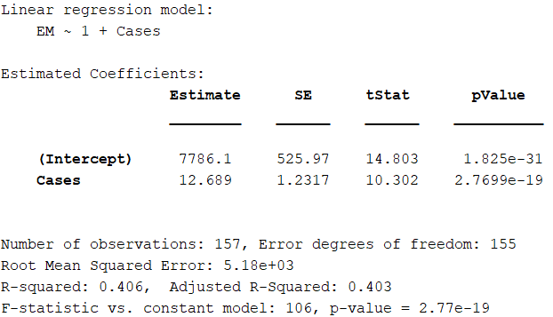
As expected, the COVID wave is a significant predictor of excess deaths in 2020-2022 and its estimated beta weight is 12.7. The R-squared shows that our simple model explains about 41% of the variance in weekly US excess deaths in 2020-2022.
How do we interpret the beta weight? It says that we expect an increase of 12.7 weekly excess deaths (“rise”) for every increase of 1 COVID case per 1M population per day (“run”). It is the rise over run relationship in the below plot of our X values (daily COVID cases per 1M) vs. the Y values (weekly excess deaths).

Note the residuals are heteroscedastic and the error terms are correlated which is typical for time series data. This may affect the reliability and statistics of the parameter estimates. I will address this in future versions of the model, but for now I want to keep the model as simple as possible.
We can use this beta weight to estimate the total number of excess deaths attributed to COVID cases (i.e. “COVID deaths”) across all of 2020-2022 using the below formula:
Where total US cases is computed as the sum over all X values * 331 (US population in millions) * 7. We multiply by 7 because the daily COVID cases were not converted to weekly cases when matching the temporal resolution of the COVID regressor to weekly deaths.
The result of the above computation yields 1,261,500 “COVID deaths” in 2020-2022. This is not too far off from the 1,091,715 COVID deaths for the same time period reported by Statista.
Not bad! But can we improve the model? Of course! A strong assumption of our first model is that COVID cases resulted in COVID deaths at the same rate across all of 2020-2022. But we know this was not true, as the case fatality rate (CFR) varied across time and decreased with successive variants of the virus. To improve our model, we can allow each COVID wave to have its own scaling factor (beta weight), rather than apply a single scaling factor to all COVID waves across all of 2020-2022.
So I split up the single COVID regressor above into 8 separate regressors like so:

Our new updated model now becomes:
Note that I removed the subscripts “t” and “t-4” for readability. We are still modeling the same Y vector as above, but the X has now been broken up into 8 “segments”, where each segment includes the daily COVID cases per 1M population for that particular COVID wave, but is zero everywhere else.
How does this model do? Let’s find out with a new estimation.

As expected, by allowing each COVID wave to have it’s own scaling factor in predicting COVID deaths, the model does a much better job of explaining the variance (84.4%) in weekly excess deaths. In addition, with a few exceptions, the severity of each COVID wave decreases over time (i.e. the first ‘Wuhan’ wave “w1” sees 150 COVID deaths per increase in 1 Daily COVID case per 1M population, whereas the Jan 2022 ‘omicron’ wave “w6” sees only 11.5).
And now, for the 1M dollar question, (LITERALLY)!
All the above is to show that we can obtain realistic, facially valid estimates of COVID deaths by modelling COVID cases and excess deaths across time. But the question we are really interested in, is can we use this same model to test whether vaccines explain a significant amount of additional variation in excess deaths in 2020-2022, above and beyond the excess deaths that are explained by COVID? And if so, did it increase, or decrease, excess deaths, and by how much??
We’ll do this by adding an extra term to the model for weekly vaccine doses, and we’ll test whether it increases the model fit. I extracted the total vaccine doses administered in the US for each week in 2021-2022 using this CDC spreadsheet (values were taken from the “Administered” column). I then plotted the weekly vaccine doses along with COVID cases and excess deaths to see what we are working with:

The new model is thus written as follows:
Where beta subscript “v” will be the estimated beta weight for vaccine doses in predicting excess deaths. In this term, no lag was applied as the bulk of vaccine deaths appear to occur within days or one week following vaccination (see slide 10 in this VAERS report by Jessica Rose).

I don’t (yet) know what is going on with w4, but this new model suggests that the COVID vaccines explain an additional ~2% variation in excess deaths in 2020-2022, above and beyond (and after effectively adjusting for) the effects of COVID cases.
Because doses and deaths are on the same weekly scale, what is neat about this output is that the beta weight for vaccine doses represents the expected increase in excess deaths per administered dose. Multiply this by one hundred, and we can get an estimated vaccine fatality rate (VFR) of ~0.03% across all ages and 2021-2022. This estimate may undershoot that actual value since the model does not account for delayed effects of vaccination.
Nonetheless, this estimate is similar to the 0.04% estimate for the first 7 months of the vaccination campaign that was previously derived in late 2021 using different CDC datasets and approach (ecological regression across states). This estimate is also the same order of magnitude as the 0.055% VFR for 2021 derived by Mark Skidmore (278,000 deaths divided by 509,998,974 doses administered in 2021) using very different data and approach (social circle survey).
Multiplying this beta weight (0.00032989) by the total number of doses administered in 2021-2022 (663,822,575) yields an estimated 218,988 excess deaths occurring within a week of and attributed to vaccination in 2021 and 2022.
Future Directions
The negative weight assigned to the COVID wave w4 will be interrogated in the next post (Part 2 in this series). Part 3 of this series addresses the fact that the model does not meet the classical assumptions of linear models, and applies lagged terms to see how long the effects persist and test whether lives were saved from vaccination (which presumably would not occur until 5 weeks post-injection). The model is also applied to each age group separately to test the hypothesis that COVID contributes less to excess deaths in younger ages while vaccines contribute more. The model can be further improved by specifying additional contributors to excess deaths in 2020-2022, modeling primary series separately from boosters, and testing the hypothesis of greater vaccine deaths in young males (vs. females) due to the greater myocarditis risk.
Conclusion
Preliminary results suggest that COVID vaccines contributed significantly (an increase of 2% explained variance) to pandemic excess deaths. Notably, the estimated beta weight yields plausible results that are a similar order of magnitude as estimates of VFR obtained by very different data sources and methods. However, the presented t-values are likely inflated because the model does not account for correlated error terms. More reliable statistics on the vaccination coefficient will be presented in a later post.
All data and code used for this post can be accessed at https://github/spiropan/STIMPED. The code can be run in Matlab or Octave. Octave is free and can be downloaded here.
Do you have a suggestion for improvement or did you catch an error? Please let me know in the comments!
Wait, there’s more!
If you enjoyed this post, please consider dropping me a tip! Your donated funds will help support my efforts to publish this work.
I was unlawfully terminated from my faculty and research scientist positions because of my research on COVID vaccine risks and benefits and other protected activity. If you would like to learn more or help me in my legal pursuit of justice, please see this link.
Hi
In my view, you allow too little time for 2. shot disaster to appear. Link
https://metatron.substack.com/p/alberta-just-inadvertently-confessed
So you see that 50% of break-thru cases appear in 15 days after 1st shot. But the damage takes more time after 2nd shot, the months 5,6,7 are peaking as breakthru cases.
This guy has a snapshot two months earlier, on nov 4th
https://robertmoloney.substack.com/p/what-the-alberta-covid-19-dashboard
The situation after the first shot is the same, only younger ages have been added.
However, the second shot is still very much evolving, it really jumps within 2 months.
And most likely there is data in the making; 1st shots are done, but there are many people under 5 months afters 2nd shot.
Please note that this Alberta data captures the Delta vawe effect; omicron was a game changer (robert has some graphs on it).
Also, by eye you can see the correlations to hospitalizations and deaths...
JR
Dr. Spiro P. Pantazatos here is the problem with your approach to Columbia University. You need to lead with a threat. Tell them that this shot is poison (you can prove it) and you will see that everyone involved in mandating the shot will be financially and legally held liable for each and every student harmed. Any appeal to morals and 'the right thing to do' is wasted on the sociopaths that find themselves in leadership positions when it comes to making money. Read 'The Allure of Toxic Leadership' by Jean Lipman-Blumen.
Here is an example of presenting consequences versus appeal to morality.
Many decades ago the family community of Rochester, Minnesota was about to get its first strip club. The city council viewed it as a cash cow when it came to taxes. The community was repulsed by the idea and the type of people it would attract. At the city council moral pleas and fears of what a strip club would do to the community were met with yawns and annoyed council members. It wasn't until someone pointed out the strip club was going to be built next to a busy highway and needed a walk-bridge over that busy highway so inebriated customers wouldn't die crossing heavy traffic. This point was followed up with a threat to see each council member held responsible for those deaths.
The result was the strip club did not want to pay for a walk-bridge. Hence, the strip club was never built.